
Apr 29, 2026
Stillness as a Visual Language: Designing Hold Less, Feel More with Michael Dreamer
Polestar EV explores the future of electric mobility, blending cutting-edge design with innovation. Dive into the performance insights shaping the next area.
Book
Design
Cover Art
Intro
Some books ask to be noticed.
This one asked to be felt.
When Michael Dreamer and I began shaping Hold Less, Feel More, the goal was never to create something loud, trendy, or visually overwhelming. The intention was quieter than that. We wanted to create a space that felt calm the moment someone saw it, and even calmer the moment they opened it.
That idea guided every decision in this project, from the cover to the opening pages to the daily spreads inside the journal.
The result is a 90-day guided journal for overthinking, anxiety, and inner peace. But more than that, it is a visual experience built around stillness.

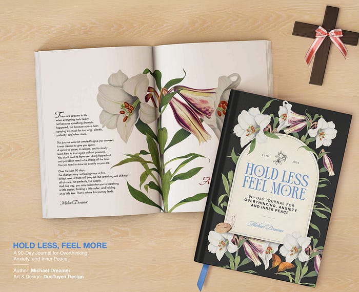
The Cover
A Quiet Invitation
The cover was the first and most important challenge.
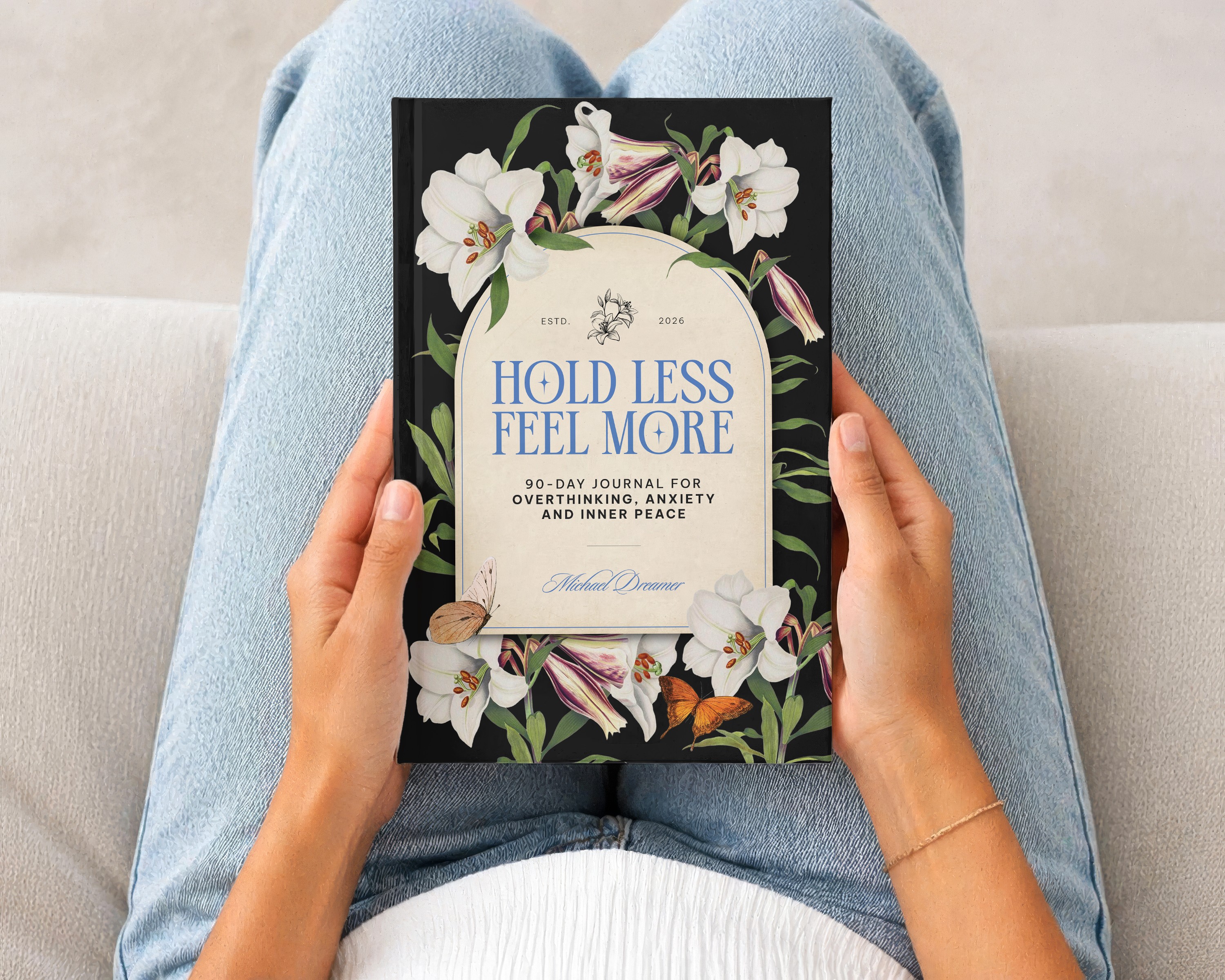
We chose a deep black background because it creates contrast, but also because it feels grounded, restrained, and slightly sacred. Against that darkness, the title in soft blue serif type becomes the emotional center. It does not shout. It simply sits there, calm and present.
The subtitle is intentionally smaller, quieter. It offers clarity without competing for attention.
The floral and butterfly elements were not added to decorate. They were placed carefully to soften the composition and introduce a sense of life and transformation. The flowers at the bottom anchor the layout, while the butterflies suggest movement without urgency.
But there is also a deeper layer behind that choice.
The flower used on the cover is the Easter lily, a symbol often associated with resurrection and renewal. It is believed to have grown in the place where Christ rose again, carrying a quiet meaning of rebirth, hope, and spiritual awakening.
That detail mattered.
Press enter or click to view image in full size
Because this journal is not just about calming the mind. It is about letting go of what you’ve been holding onto for too long, and slowly returning to a lighter, more grounded state of being.
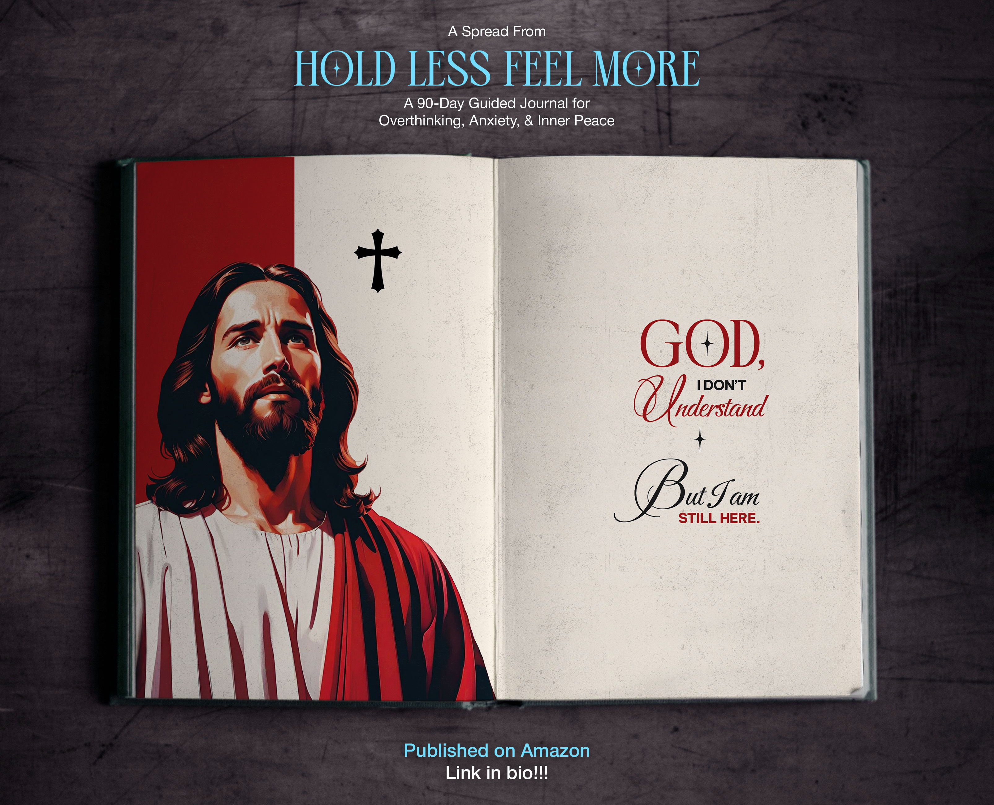
Throughout the book, many reflections are paired with scripture. Not in a way that feels heavy or instructional, but as gentle anchors. Small reminders that even in stillness, there is guidance. Even in silence, there is presence.
The Easter lily became a visual extension of that idea.
Press enter or click to view image in full size

Back cover Hold Less, Feel More
It does not dominate the cover. It does not demand attention. It simply exists, quietly, carrying meaning for those who recognize it, and offering beauty for those who don’t.
In many ways, that is exactly what this book is meant to do.


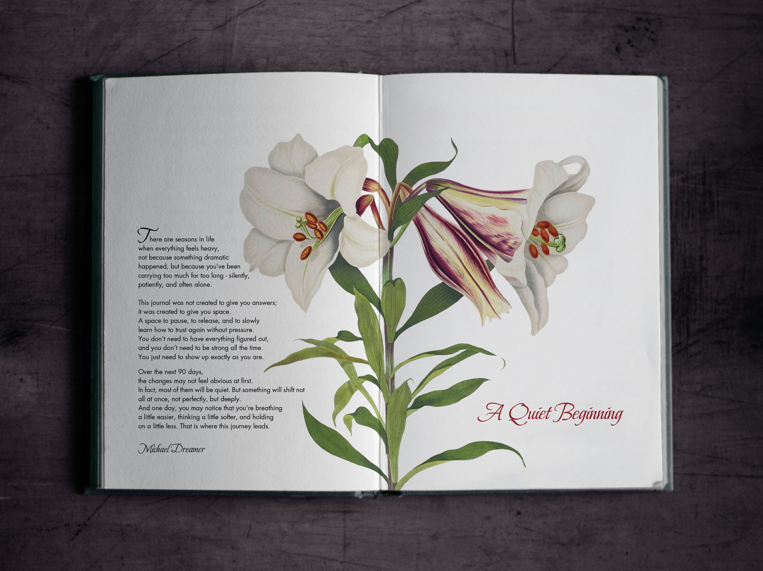
The Opening
A Quiet Beginning
Inside the book, the tone shifts from visual impression to emotional presence.
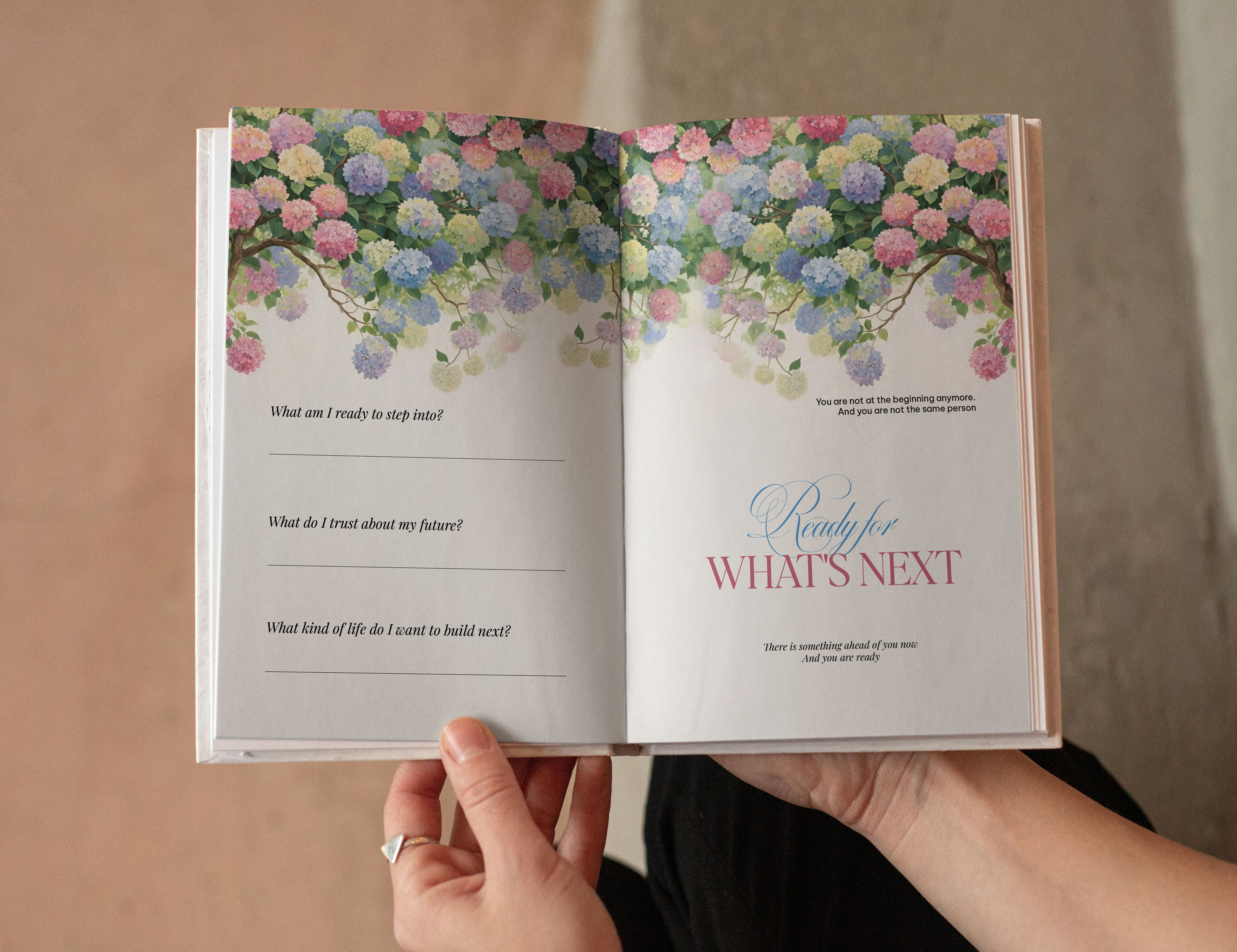
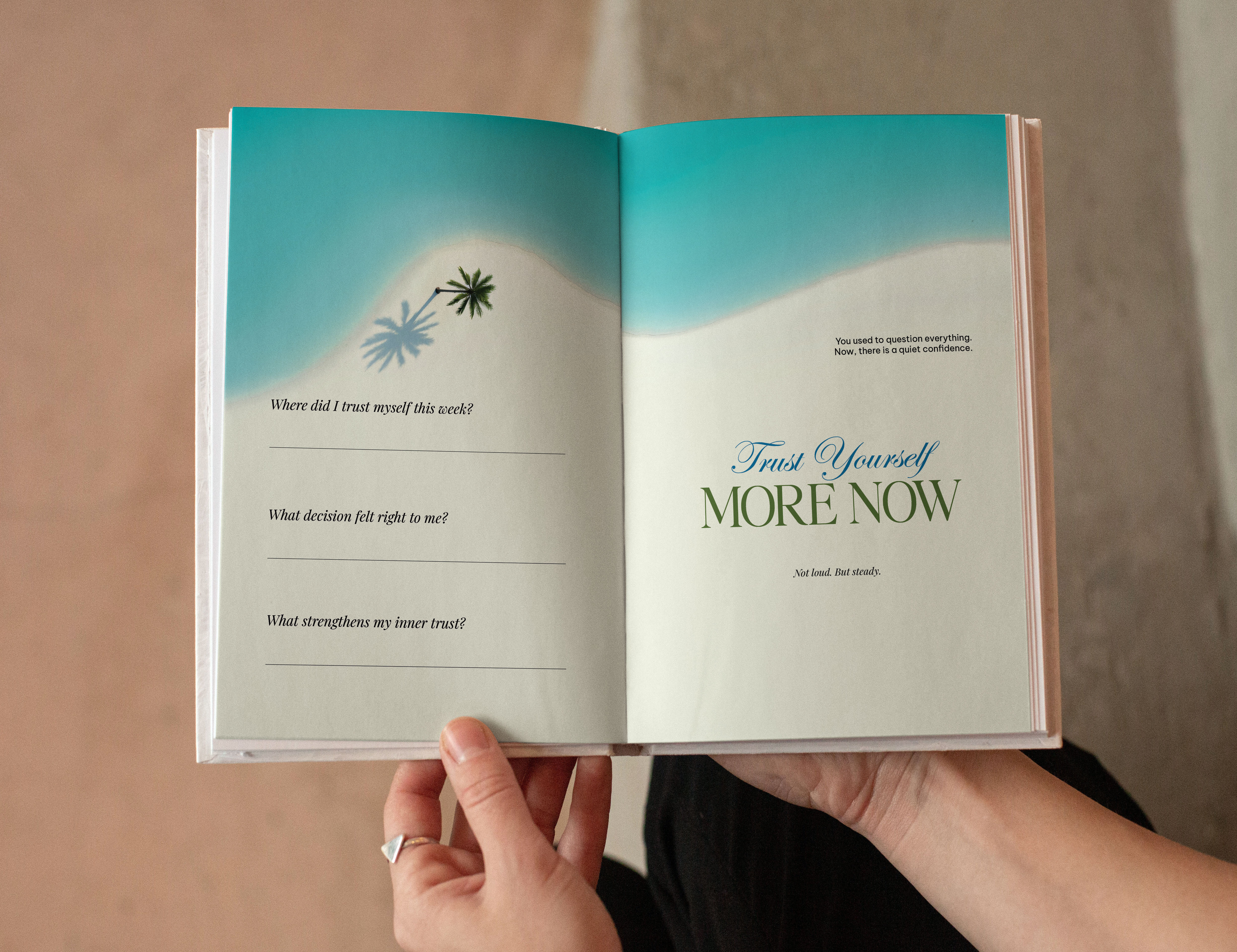
The opening spread, titled A Quiet Beginning, was designed to feel like a breath after a long exhale. A botanical illustration stretches across the center, almost as if the book is slowly unfolding into itself.
The left page holds the author’s words. The right page carries a simple, elegant title. There is space around everything. Space to pause. Space to arrive.
We didn’t want the opening to feel like something to skip.
Press enter or click to view image in full size
We wanted it to feel like the first moment you allow yourself to slow down.
The Interior: A Conversation Between Guidance and Space
Each daily spread follows a simple structure, but that simplicity is intentional.
On one side, there is gentle guidance. A reflection, sometimes a scripture, and a soft emotional prompt. On the other side, there is space. Open, quiet, and waiting.
That balance matters.
We did not want the reader to feel instructed. We wanted them to feel supported.
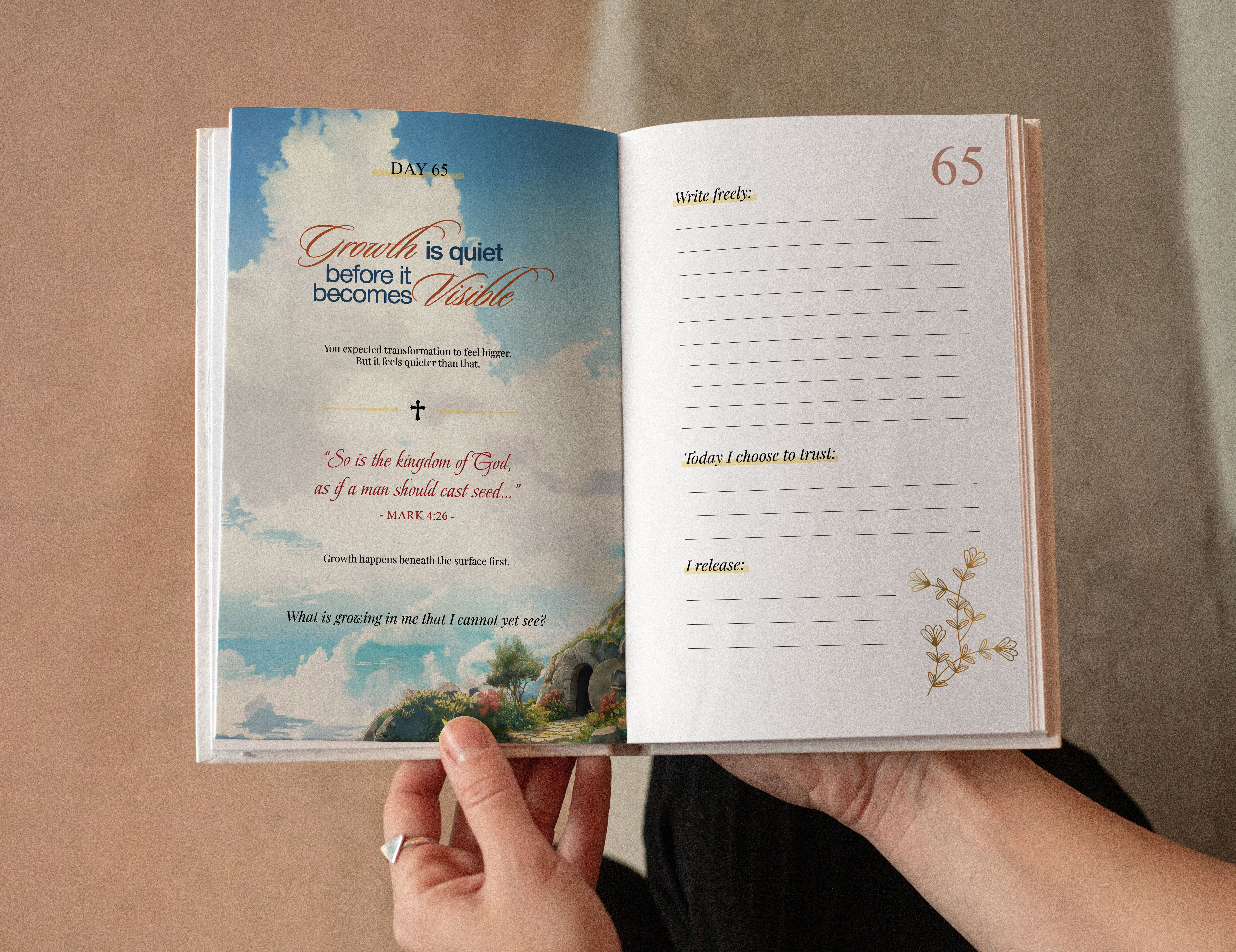
The typography stays soft and readable. The layout avoids clutter. Decorative elements appear lightly, just enough to create a mood without interrupting the experience.
Even the weekly reflection pages are designed to feel more open, more spacious. They are not checkpoints. They are pauses. Places to notice what has shifted, even if that shift is small.
Because most real change is.
Designing for Less
Most design projects push toward more.
More contrast.
More elements.
More attention.
This project asked for the opposite.
We kept removing until what remained felt honest. Until the pages felt breathable. Until the design no longer stood in front of the reader, but quietly stepped aside.
A journal like this cannot afford to be loud.
The reader is already carrying enough.
The design has to make that weight feel lighter.
A Shared Direction
Working with Michael Dreamer felt less like executing a vision and more like aligning with one.
His writing stayed consistent in tone, calm, reflective, and deeply human. That clarity made it possible for the design to follow naturally. There was no need to overcomplicate anything.
We were not building something to impress.
We were building something that someone could return to.
Something that could sit quietly beside them, without asking for anything, but always offering space.
Press enter or click to view image in full size
What Remains
Looking at the finished book now, what stands out is not any single page or element.
It is the rhythm.
Hold less.
Feel more.
Pause.
Write.
Release.
Return.
That rhythm begins on the cover. It deepens in the opening pages. It continues through the 90-day journey.
And if the design has done its job, by the end of it, the reader may not feel dramatically different.
But they may feel lighter.
And sometimes, that is enough.
If you’d like to explore the book, it is now available on Amazon here:
👉 Link: Hold Less, Feel More
No pressure. Just a place to begin.
HOLD LESS, FEEL MORE
Author: Michael Dreamer
Art & Design: DucTuyen Design


FAQ
01
What types of projects do you take on?
02
How does the process work?
03
How long does a project take?
04
Do you work with international clients?
05
What do you need to get started?
06
Can you work with an existing brand?
07
Do you offer revisions?
08
How do we handle feedback?
Apr 29, 2026
Stillness as a Visual Language: Designing Hold Less, Feel More with Michael Dreamer
Polestar EV explores the future of electric mobility, blending cutting-edge design with innovation. Dive into the performance insights shaping the next area.
Book
Design
Cover Art
Intro
Some books ask to be noticed.
This one asked to be felt.
When Michael Dreamer and I began shaping Hold Less, Feel More, the goal was never to create something loud, trendy, or visually overwhelming. The intention was quieter than that. We wanted to create a space that felt calm the moment someone saw it, and even calmer the moment they opened it.
That idea guided every decision in this project, from the cover to the opening pages to the daily spreads inside the journal.
The result is a 90-day guided journal for overthinking, anxiety, and inner peace. But more than that, it is a visual experience built around stillness.
The Cover
A Quiet Invitation
The cover was the first and most important challenge.
We chose a deep black background because it creates contrast, but also because it feels grounded, restrained, and slightly sacred. Against that darkness, the title in soft blue serif type becomes the emotional center. It does not shout. It simply sits there, calm and present.
The subtitle is intentionally smaller, quieter. It offers clarity without competing for attention.
The floral and butterfly elements were not added to decorate. They were placed carefully to soften the composition and introduce a sense of life and transformation. The flowers at the bottom anchor the layout, while the butterflies suggest movement without urgency.
But there is also a deeper layer behind that choice.
The flower used on the cover is the Easter lily, a symbol often associated with resurrection and renewal. It is believed to have grown in the place where Christ rose again, carrying a quiet meaning of rebirth, hope, and spiritual awakening.
That detail mattered.
Press enter or click to view image in full size
Because this journal is not just about calming the mind. It is about letting go of what you’ve been holding onto for too long, and slowly returning to a lighter, more grounded state of being.
Throughout the book, many reflections are paired with scripture. Not in a way that feels heavy or instructional, but as gentle anchors. Small reminders that even in stillness, there is guidance. Even in silence, there is presence.
The Easter lily became a visual extension of that idea.
Press enter or click to view image in full size
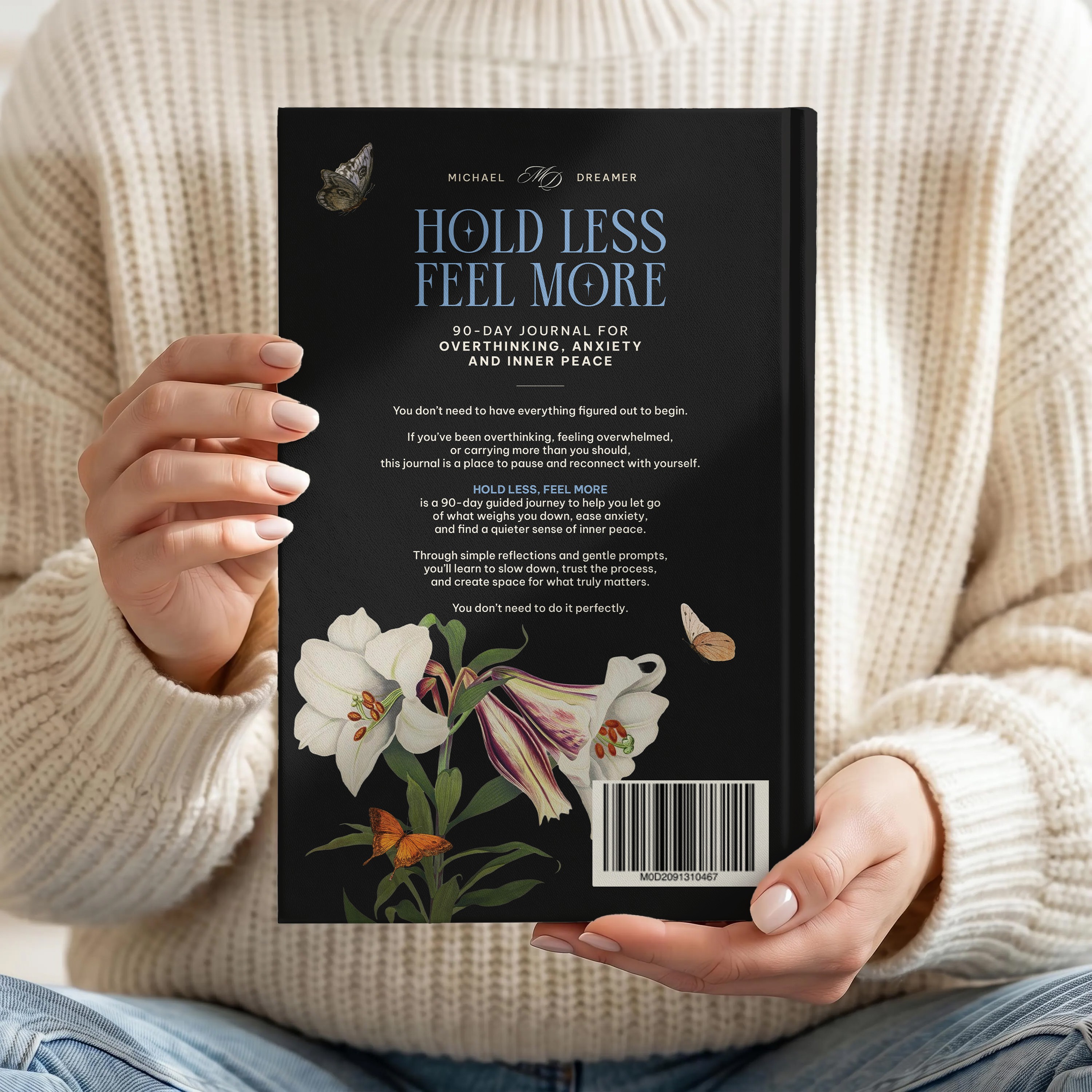
Back cover Hold Less, Feel More
It does not dominate the cover. It does not demand attention. It simply exists, quietly, carrying meaning for those who recognize it, and offering beauty for those who don’t.
In many ways, that is exactly what this book is meant to do.
The Opening
A Quiet Beginning
Inside the book, the tone shifts from visual impression to emotional presence.
The opening spread, titled A Quiet Beginning, was designed to feel like a breath after a long exhale. A botanical illustration stretches across the center, almost as if the book is slowly unfolding into itself.
The left page holds the author’s words. The right page carries a simple, elegant title. There is space around everything. Space to pause. Space to arrive.
We didn’t want the opening to feel like something to skip.
Press enter or click to view image in full size
We wanted it to feel like the first moment you allow yourself to slow down.
The Interior: A Conversation Between Guidance and Space
Each daily spread follows a simple structure, but that simplicity is intentional.
On one side, there is gentle guidance. A reflection, sometimes a scripture, and a soft emotional prompt. On the other side, there is space. Open, quiet, and waiting.
That balance matters.
We did not want the reader to feel instructed. We wanted them to feel supported.
The typography stays soft and readable. The layout avoids clutter. Decorative elements appear lightly, just enough to create a mood without interrupting the experience.
Even the weekly reflection pages are designed to feel more open, more spacious. They are not checkpoints. They are pauses. Places to notice what has shifted, even if that shift is small.
Because most real change is.
Designing for Less
Most design projects push toward more.
More contrast.
More elements.
More attention.
This project asked for the opposite.
We kept removing until what remained felt honest. Until the pages felt breathable. Until the design no longer stood in front of the reader, but quietly stepped aside.
A journal like this cannot afford to be loud.
The reader is already carrying enough.
The design has to make that weight feel lighter.
A Shared Direction
Working with Michael Dreamer felt less like executing a vision and more like aligning with one.
His writing stayed consistent in tone, calm, reflective, and deeply human. That clarity made it possible for the design to follow naturally. There was no need to overcomplicate anything.
We were not building something to impress.
We were building something that someone could return to.
Something that could sit quietly beside them, without asking for anything, but always offering space.
Press enter or click to view image in full size
What Remains
Looking at the finished book now, what stands out is not any single page or element.
It is the rhythm.
Hold less.
Feel more.
Pause.
Write.
Release.
Return.
That rhythm begins on the cover. It deepens in the opening pages. It continues through the 90-day journey.
And if the design has done its job, by the end of it, the reader may not feel dramatically different.
But they may feel lighter.
And sometimes, that is enough.
If you’d like to explore the book, it is now available on Amazon here:
👉 Link: Hold Less, Feel More
No pressure. Just a place to begin.
HOLD LESS, FEEL MORE
Author: Michael Dreamer
Art & Design: DucTuyen Design
FAQ
01
What types of projects do you take on?
02
How does the process work?
03
How long does a project take?
04
Do you work with international clients?
05
What do you need to get started?
06
Can you work with an existing brand?
07
Do you offer revisions?
08
How do we handle feedback?
Apr 29, 2026
Stillness as a Visual Language: Designing Hold Less, Feel More with Michael Dreamer
Polestar EV explores the future of electric mobility, blending cutting-edge design with innovation. Dive into the performance insights shaping the next area.
Book
Design
Cover Art
Intro
Some books ask to be noticed.
This one asked to be felt.
When Michael Dreamer and I began shaping Hold Less, Feel More, the goal was never to create something loud, trendy, or visually overwhelming. The intention was quieter than that. We wanted to create a space that felt calm the moment someone saw it, and even calmer the moment they opened it.
That idea guided every decision in this project, from the cover to the opening pages to the daily spreads inside the journal.
The result is a 90-day guided journal for overthinking, anxiety, and inner peace. But more than that, it is a visual experience built around stillness.
The Cover
A Quiet Invitation
The cover was the first and most important challenge.
We chose a deep black background because it creates contrast, but also because it feels grounded, restrained, and slightly sacred. Against that darkness, the title in soft blue serif type becomes the emotional center. It does not shout. It simply sits there, calm and present.
The subtitle is intentionally smaller, quieter. It offers clarity without competing for attention.
The floral and butterfly elements were not added to decorate. They were placed carefully to soften the composition and introduce a sense of life and transformation. The flowers at the bottom anchor the layout, while the butterflies suggest movement without urgency.
But there is also a deeper layer behind that choice.
The flower used on the cover is the Easter lily, a symbol often associated with resurrection and renewal. It is believed to have grown in the place where Christ rose again, carrying a quiet meaning of rebirth, hope, and spiritual awakening.
That detail mattered.
Press enter or click to view image in full size
Because this journal is not just about calming the mind. It is about letting go of what you’ve been holding onto for too long, and slowly returning to a lighter, more grounded state of being.
Throughout the book, many reflections are paired with scripture. Not in a way that feels heavy or instructional, but as gentle anchors. Small reminders that even in stillness, there is guidance. Even in silence, there is presence.
The Easter lily became a visual extension of that idea.
Press enter or click to view image in full size
Back cover Hold Less, Feel More
It does not dominate the cover. It does not demand attention. It simply exists, quietly, carrying meaning for those who recognize it, and offering beauty for those who don’t.
In many ways, that is exactly what this book is meant to do.
The Opening
A Quiet Beginning
Inside the book, the tone shifts from visual impression to emotional presence.
The opening spread, titled A Quiet Beginning, was designed to feel like a breath after a long exhale. A botanical illustration stretches across the center, almost as if the book is slowly unfolding into itself.
The left page holds the author’s words. The right page carries a simple, elegant title. There is space around everything. Space to pause. Space to arrive.
We didn’t want the opening to feel like something to skip.
Press enter or click to view image in full size
We wanted it to feel like the first moment you allow yourself to slow down.
The Interior: A Conversation Between Guidance and Space
Each daily spread follows a simple structure, but that simplicity is intentional.
On one side, there is gentle guidance. A reflection, sometimes a scripture, and a soft emotional prompt. On the other side, there is space. Open, quiet, and waiting.
That balance matters.
We did not want the reader to feel instructed. We wanted them to feel supported.
The typography stays soft and readable. The layout avoids clutter. Decorative elements appear lightly, just enough to create a mood without interrupting the experience.
Even the weekly reflection pages are designed to feel more open, more spacious. They are not checkpoints. They are pauses. Places to notice what has shifted, even if that shift is small.
Because most real change is.
Designing for Less
Most design projects push toward more.
More contrast.
More elements.
More attention.
This project asked for the opposite.
We kept removing until what remained felt honest. Until the pages felt breathable. Until the design no longer stood in front of the reader, but quietly stepped aside.
A journal like this cannot afford to be loud.
The reader is already carrying enough.
The design has to make that weight feel lighter.
A Shared Direction
Working with Michael Dreamer felt less like executing a vision and more like aligning with one.
His writing stayed consistent in tone, calm, reflective, and deeply human. That clarity made it possible for the design to follow naturally. There was no need to overcomplicate anything.
We were not building something to impress.
We were building something that someone could return to.
Something that could sit quietly beside them, without asking for anything, but always offering space.
Press enter or click to view image in full size
What Remains
Looking at the finished book now, what stands out is not any single page or element.
It is the rhythm.
Hold less.
Feel more.
Pause.
Write.
Release.
Return.
That rhythm begins on the cover. It deepens in the opening pages. It continues through the 90-day journey.
And if the design has done its job, by the end of it, the reader may not feel dramatically different.
But they may feel lighter.
And sometimes, that is enough.
If you’d like to explore the book, it is now available on Amazon here:
👉 Link: Hold Less, Feel More
No pressure. Just a place to begin.
HOLD LESS, FEEL MORE
Author: Michael Dreamer
Art & Design: DucTuyen Design
FAQ
What types of projects do you take on?
How does the process work?
How long does a project take?
Do you work with international clients?
What do you need to get started?
Can you work with an existing brand?
Do you offer revisions?
How do we handle feedback?